.png) ☰☰
☰☰We mapped and measured every operating US AI data center we could confirm a boundary for — 36 in all — across six thermal layers, from the surface a satellite sees to the air the site breathes. These are the five running hottest, and what the layers reveal about why one number is never enough.
THE SHORT VERSION
AI infrastructure is expanding faster than many locations can fully assess the thermal conditions surrounding long-lived data-center investments. Site selection commonly weighs power, land, connectivity, incentives and water availability — but localized heat exposure is often assessed only after substantial capital decisions have already been made.
FortyGuard developed DATS — the Data-center Ambient Thermal Screen — to bring that view forward. The DATS 2025 Baseline examines peak-summer thermal conditions across major U.S. AI data-center campuses, combining regional weather, satellite-observed surface temperature, campus-scale spatial variation, extreme-heat exposure and drought context into one comparable score.
DATS is a screening and decision-support layer — not a certification, not an engineering-design verdict, and not a substitute for detailed site due diligence. It exists to identify where deeper investigation is warranted, to compare thermal context across sites and portfolios, and to help infrastructure teams ask better questions before capital is committed.
The heat signature of an AI data center is not one number. It is at least six — the temperature of its roofs and pavement, the air above them, what that air feels like once humidity is counted, how unevenly the heat sits inside the fence, how far the campus stands out from the land around it, and the drought context of the county it occupies. Read only one, and you will mis-rank almost every site.
To build a like-for-like picture, we measured all six across 36 confirmed, operating US AI data centers with mapped footprints, over the peak-summer window of June–August 2025 — combining satellite surface temperature at 30 m, FortyGuard's LTM 2 m air-temperature microclimate, hourly humidity-derived heat stress, and county drought context into a single transparent 0–100 DATS Score.
Every figure below is a measured thermal quantity — never a cost, energy, water, or PUE estimate, and no site's PUE is computed. And exposure is a property of the environment a facility operates in, not a verdict on how well it operates: a high score says the conditions are demanding, not that any operator is failing to meet them.
This post is about the five sites that scored highest — and the counterintuitive finding that no two of them are hot the same way.
The baseline covers 36 operating US AI data centers — hyperscale campuses, national-lab supercomputers, and named training clusters — each reduced to its mapped building footprint and profiled over the 92 days of meteorological summer, 1 June to 31 August 2025. For every site we computed six thermal layers, percentile-ranked each one within the cohort, and blended them by weight-normalised average into one comparable score.
Because the ranking is percentile-based, the DATS Score is explicitly relative: it places a site against the operating US field, not against an absolute threshold of concern. The median score across all 36 sites is 51; the five profiled here run from 75 to 88, roughly 24 to 37 points above the middle of the field.
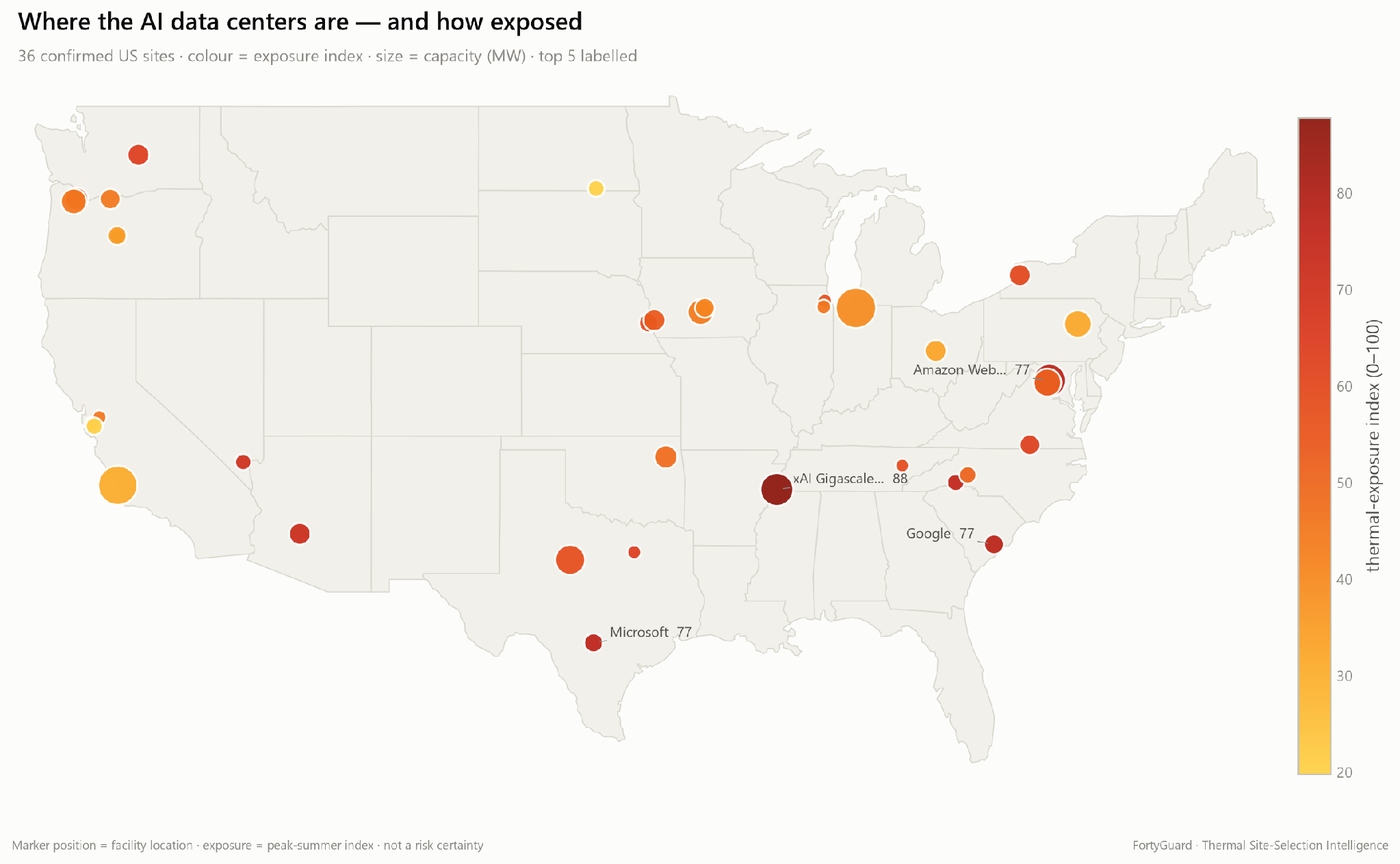
Every finding below is grounded in one or more of these measured layers.
Surface, air, and humidity are distinct physical quantities measured by distinct instruments. They are combined only as ranked screening indicators, never summed as if they were the same thing.
Already the table refuses to behave. The site with the hottest air (Microsoft, 29.7 °C) has almost the coolest surfaces relative to its surroundings. The site with the widest internal variation (Amazon, 18.6 °C) has the lowest surface peak of the five. Rank them on any single column and you get five different orderings.

What follows is the same five sites, read one layer deeper each time.
The headline number is 61 °C — the peak surface temperature at xAI's Memphis campus, measured from orbit at 30 m over the actual building footprint. Its summer-median footprint runs 56 °C.
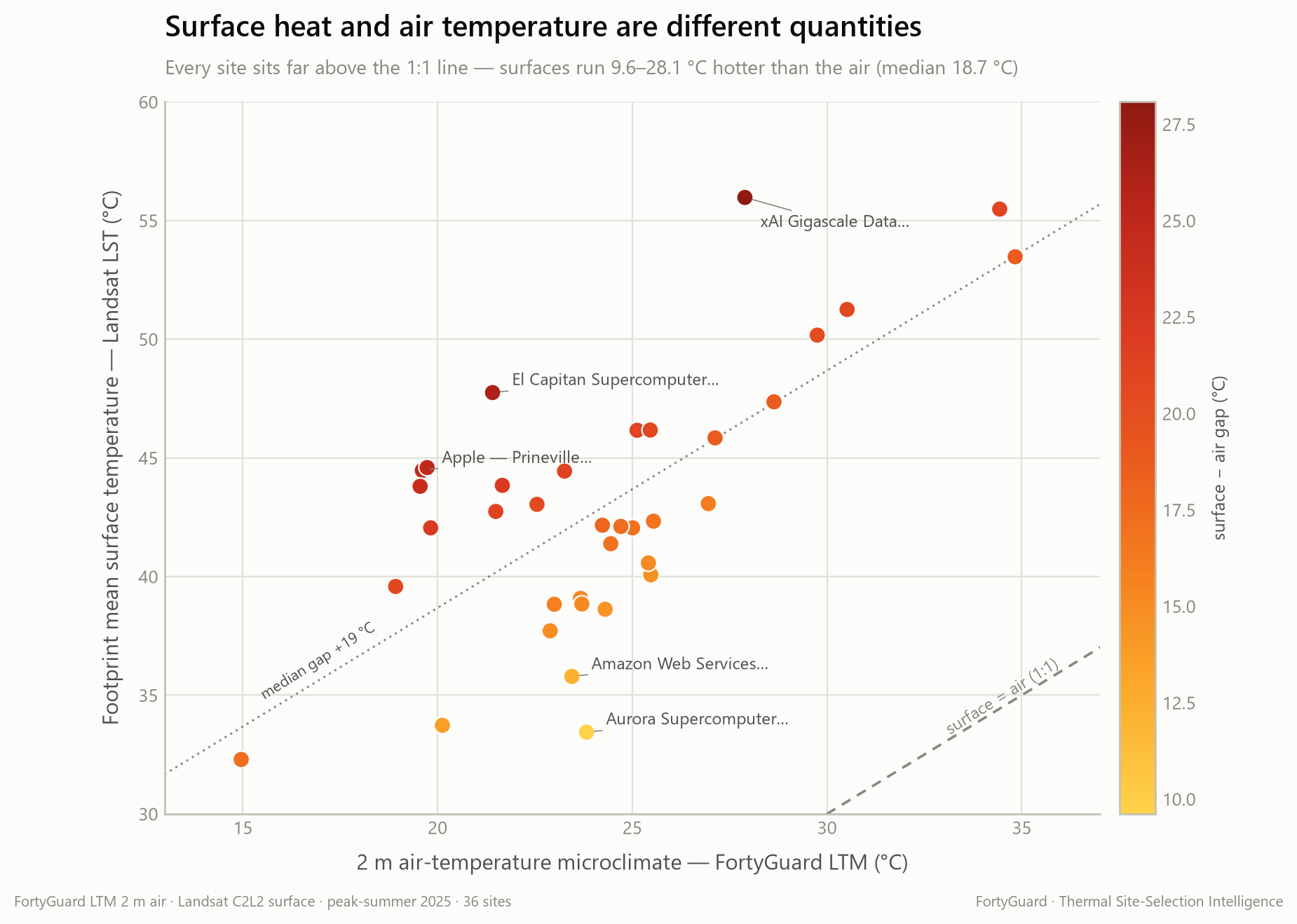
That is the surface, not the air. Land-surface temperature is what the roofs, pavement and equipment yards radiate, and across this cohort it runs 9.6–28.1 °C hotter than the air above it, with a median gap of 18.7 °C. The two are different measurements taken by different instruments, and confusing them is the most common error in reading a thermal map — 61 °C read as an air temperature would be not just wrong but implausible.
At the top of that range, the gap approaches 29 °C, and a gap that wide is a material thermal-performance warning. It indicates that the campus surface environment may be absorbing and re-radiating substantially more heat than the surrounding air conditions alone would suggest. This does not, by itself, establish the cause or quantify any cooling-energy impact — but it is strong evidence that materials, layout, shading, vegetation, equipment heat rejection and operating conditions warrant closer investigation.
That is also the practical distinction. Surface temperature is what a dry cooler, a rooftop unit, or a condenser sitting in that heat actually sees; air temperature is what the psychrometrics assume. The gap between them is the part of the environment that site design can most directly influence.

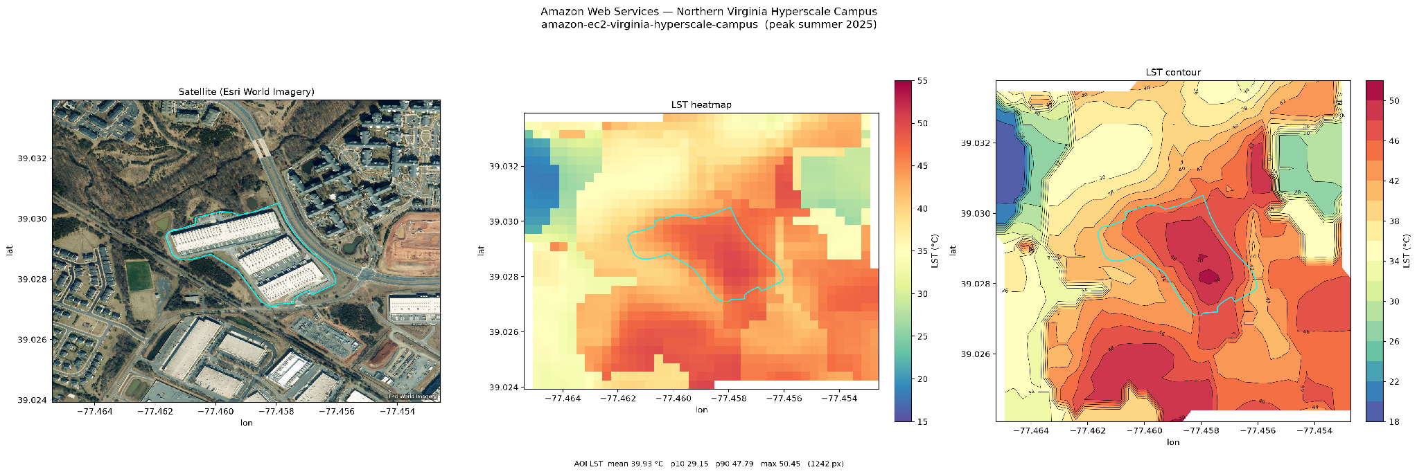
The footprint average hides a map. Measured as the gap between the hottest and coolest tenth of pixels on a campus, surface temperature swings by up to 18.6 °C — Amazon's Northern Virginia campus leads on this — with scorching roofs and pavement sitting beside cooler ground and vegetation. Four of the five vary by more than 10 °C across their own site.
A single “site temperature” would erase that structure entirely, and with it any sense of where on a campus the heat concentrates. That is the difference between a number and a map: the number tells you a campus is hot, the map tells you which roof, which yard, which intake to look at first.
Patchiness also carries a diagnostic signal. A uniformly warm campus is usually reporting its region back to you. A patchy one is reporting something about its own construction — materials, coverage, and layout — which is the part of the picture design can still move.
Subtract the building and measure only the rings around it, and the campus still stands out. xAI runs +11.5 °C hotter than everything within 1 km.
The intuition is that this contrast should fade with distance — that a hot campus should blend back into a warm landscape a few kilometres out. It does the opposite. The contrast widens, reaching +17.7 °C against the land 4 km out: the campus remains thermally distinguishable from its surrounding context at distances of up to approximately 4 km.
What that does and does not mean is worth being precise about. The measurement establishes thermal distinctness and spatial persistence — the campus reads differently from its context, and keeps reading differently as you move outward. It is not a demonstration that the facility physically warms the land four kilometres away; establishing that would require directional heat-propagation analysis this screen does not perform. Three of the other four here clear +10 °C at 1 km as well.

It is not only the surfaces. Compare each campus's 2 m air microclimate against the air temperature of the city it sits in, and each of the five ran hotter than its own city on 95–100 % of summer days — Google's Berkeley County campus on 98% of them, against a Moncks Corner baseline; Meta's Forest City campus on essentially all of them.
These are modest offsets — roughly +0.1 to +0.8 °C on average, in an air field that is well mixed and measured at kilometre scale. The magnitude is not the finding. The persistence is: where a site runs warmer than its metro, it tends to do so almost every day rather than occasionally, which is what turns a rounding error into a baseline.
Frequency and magnitude also come apart, which is worth stating plainly. Meta's Forest City campus has the smallest average offset of the five (+0.1 °C) and the highest frequency; Microsoft's San Antonio campus has the largest offset (+0.8 °C) at a lower frequency. Read this layer as how often, not how much. The comparison is also cross-model — FortyGuard LTM microclimate against an ERA5 city baseline — so the frequency is the robust half of it.

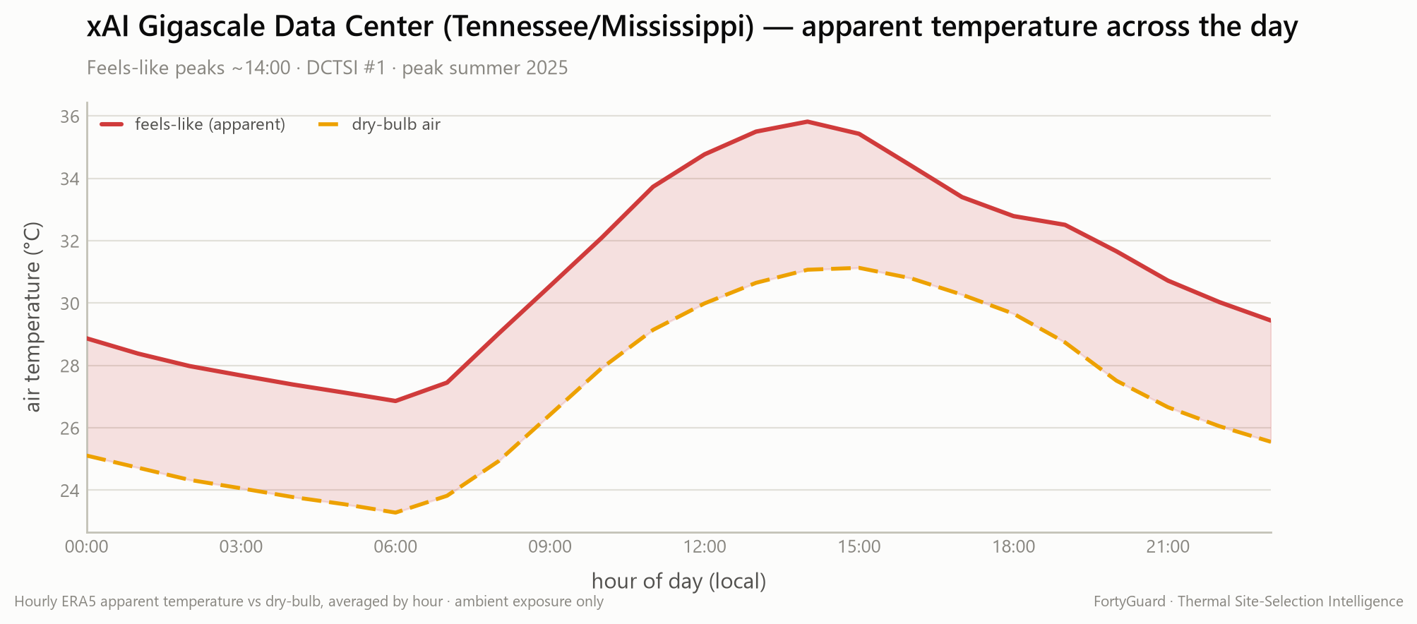
Add humidity, and the number that matters is what the air feels like. Across the five, apparent temperature peaks at 35–37 °C — and it peaks on a schedule, every afternoon around 14:00–15:00. That is precisely when ambient cooling headroom is thinnest: the moment the outside air is least able to help is the moment the heat load is highest.
Wet-bulb temperature makes the same point from the other direction. Wet-bulb is the floor evaporative cooling can reach at a given humidity — the physical limit, before any equipment enters the conversation. Across the five it runs 24.2–26.1 °C, and the gap between air and wet-bulb is where the two humid-South sites separate from the dry-heat one:
The hotter site by dry-bulb is the easier one by wet-bulb. This is exactly the inversion a single temperature reading destroys, and it is the layer that most directly touches cooling strategy.
The sixth layer is not a temperature at all, and it is the one that separates the field most sharply.
Using the US Drought Monitor's Drought Severity and Coverage Index (DSCI, a 0–500 county-scale measure) over the same window, the county holding Microsoft's San Antonio campus scored 408 — against 11 to 36 for the other four. On this layer it sits at the very top of the cohort while the four humid-South sites sit near the bottom.
Two clarifications matter here. This is county-scale regional context, never a facility water-use figure — we do not measure or estimate what any site consumes. And drought is included because it constrains the environment an evaporative or hybrid cooling strategy has to operate in, and because it is the layer least likely to be visible in a temperature map. A site can be moderate on every thermal layer and still be operating in a water-stressed region; a site can be extreme on surface heat and sit in a county with essentially no drought signal. Both cases appear in these five.

Here is the result that a single temperature would bury. The five sites cluster within 13 points of each other — but they reach those scores through completely different layers.
Microsoft's San Antonio campus is exposed almost entirely through regional heat and drought: it sits in the 89th percentile for surface heat, the 92nd for air temperature, and the 100th — the top of the cohort — for drought context, while its stands-out (+3.6 °C at 1 km) and internal-patchiness (7.1 °C) layers are among the lowest in the set. It is hot because of where it is.
xAI's Memphis campus reaches a similar band through the opposite route: top-of-cohort surface heat and top-of-cohort local contrast — it is hot because of what stands on the land, and how far it rises above everything around it.
Split each score into the layers a location fixes and the layers a build influences, and the pattern is clean: four of the five land at roughly 60–67 % region-driven, while Microsoft's San Antonio sits near 80 %. Same band on the leaderboard. Different composition underneath.
That distinction is invisible in a ranking and obvious the moment the score is broken into its layers. It also marks the boundary of what a screen can resolve. There are three different things in play here, and DATS separates the first two while deliberately stopping short of the third:

The clearest evidence that this is a siting signal rather than an operator signal comes from comparing a single company's portfolio against itself.
Amazon's Northern Virginia campus scores 77. Two other Amazon sites in the same cohort score in the low 30s — a gap of more than 40 points inside one operator's own estate, across facilities of broadly the same asset class, built to the same standards, run by the same organisation.
Nothing about the operator changed between those sites. The land did.
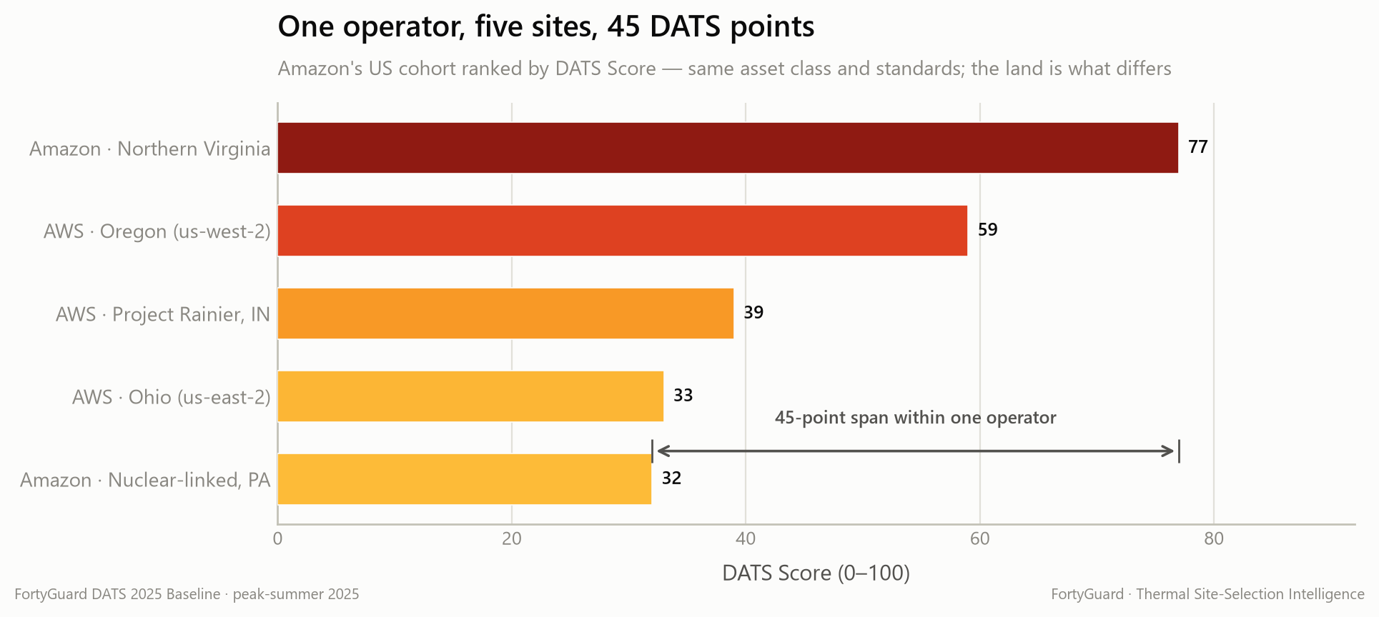
Thermal conditions compound over the life of an asset. A data center commissioned today may operate for decades in the conditions its site selection locked in, and the layers that are fixed by geography are exactly the ones that cannot be engineered away later. Developers should understand the thermal context they are entering before capital is committed — which is the entire argument for screening early, when the fixed layers are still a choice.
For these sites and the 31 others in the baseline, DATS produces:
A high score means look here first; the layers tell you what to look at. A site that is region-driven argues for a different response than one that is build-driven — the first is a question for site selection and cooling architecture, the second for materials, layout and surface treatment. Neither is a verdict; both are prompts for the engineering work that follows.
One summer is a baseline, not a trend — and a single season cannot carry a capital argument about an asset expected to run for decades. The planned extension of this work, DATS Climate, is designed to close that gap:
None of that is in the 2025 Baseline. It is what we are building next, and it is where a screen like this becomes genuinely useful for assets with thirty-year horizons.
The five profiled here are the most exposed — but they are five of thirty-six, and the rest of the field is just as instructive. The other 31 include sites that sit cooler than their own surroundings: engineered campuses in the arid and marine West that are less thermally extreme than the desert or bare ground around them. A negative contrast is a real result, and it only shows up if you measure the surroundings separately instead of assuming the building is always the hot thing in the frame.
Exposure, it turns out, has a geography — hottest across the humid South, with a clean East–West divide in how much the ambient air can help with cooling.
None of the underlying methods are specific to these sites, or to data centers. The same six-layer screen — satellite surface temperature, a 2 m air microclimate, humidity-derived heat stress, building-subtracted surroundings, and regional drought context — applies to any footprint, in any market, anywhere there is sun and a boundary to draw. Which is virtually every site a portfolio will ever consider.
The five profiled here are the top of a 36-site field. The full DATS 2025 Baseline covers all 36 confirmed operating US AI data centers across the six thermal layers — including the sites that run cooler than their own surroundings — with per-site layer breakdowns, surface heat-load maps and the full method.
Read the full DATS Baseline Report →
The live screen lets you move through the cohort site by site and see where the heat sits on each footprint. The same screen extends to prospective sites, multi-campus portfolios, and recurring monitoring of operating estates.
Want this for your portfolio? Reach the FortyGuard team at info@fortyguard.com.
We're mapping the thermal reality of AI infrastructure, site by site.
Surface temperature: Landsat 8/9 Collection 2 Level-2, 30 m, cloud-masked, per-pixel summer median, emissivity from NDVI. Air microclimate: FortyGuard LTM (~1 km, 2 m). Humidity-derived feels-like and wet-bulb: hourly ERA5 reanalysis (wet-bulb after Stull, 2011). Facility-vs-surroundings: dilation rings that subtract the building to isolate the surroundings; Δ = footprint mean − ring mean. Intra-footprint spread: p90 − p10 of surface temperature. Drought: US Drought Monitor DSCI, county scale, as regional context only. Boundaries: OpenStreetMap (ODbL). Six measured layers, percentile-ranked within the cohort and weight-blended into one 0–100 DATS Score. Window: 1 June – 31 August 2025.
Worth stating plainly, because they bound how the numbers should be read.
.png)
.png)


.png)
.png)

.png)